Contents
- Read the Categories as Different Parts of a Scene
- What the Explore Interface Shows
- A Practical Checklist for Comparing Templates
- What a Documented Video Example Reveals About Source Images
- The Details Needed to Compare Mimisy’s Value
- Who Mimisy’s Gallery Suits Best
Choosing an AI porn video generator often starts with a simpler question than model quality: can you find a visual concept that matches what you have in mind? Mimisy.com approaches that problem with a categorized template gallery. Its Explore interface combines category chips, preview cards, search, and displayed durations, giving visitors several ways to narrow a broad idea.
The visible library is useful for comparing concepts before committing to one. Static previews cannot establish generation quality, however, and the available evidence does not settle Mimisy’s pricing or complete generation workflow. That makes this a practical assessment of its template browsing experience, with a clear distinction between what the interface shows and what a purchase decision still requires.
Read the Categories as Different Parts of a Scene
Mimisy’s category list mixes framing, viewpoint, participant arrangements, activities, and presentation. That breadth creates several routes into the library, but it also explains why scanning every label in order can feel cumbersome.
A more useful way to read the collection is to separate the questions its labels answer:
| Category type | Examples | What it helps you compare |
|---|---|---|
| Framing | Portrait, close-up, full-body | How much of the subject appears |
| Viewpoint | POV | The apparent relationship between the camera and scene |
| Layout | Splitscreen | Whether the composition uses separate visual regions |
| Subject arrangement | Solo, couple, duo | The intended number or arrangement of people |
| Presentation | Cute, tease, SFW | The broad tone or content category |
| Scenario | Roleplay, massage | The setting or activity suggested by the concept |
These labels work best as starting points. Portrait narrows the crop, but it does not explain the background or movement. Solo tells you about the subject arrangement without identifying the camera position. A scenario category can contain several different compositions.
The overlap between couple and duo is particularly noticeable. Their names suggest similar arrangements, so the preview becomes more useful than the wording when choosing between them. Look at how much of each person is visible, where they sit within the frame, and whether their outlines remain easy to distinguish.
This is the practical value of reorganizing the list mentally: instead of comparing unlike labels, decide which part of the scene matters most. Someone interested primarily in framing can start with portrait or full-body. Someone focused on the overall arrangement can begin with solo or couple, then inspect the crop within those results.
What the Explore Interface Shows
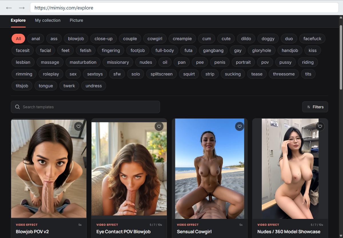
The Explore interface shows All selected above several rows of category chips. Below those chips are a Search templates field, a Filters button, and a grid of preview cards with heart icons.
The layout supports both broad browsing and a more focused search. Search, filters, and hearts are visible controls; the available record does not establish their exact behavior. For example, it does not show which filters open or whether a heart saves a card to an account.
The previews offer more immediate comparison material. The visible cards differ in crop, pose, background, and apparent viewpoint. A tightly framed preview directs attention to a smaller part of the scene, while a wider preview exposes more of the subject and surrounding space. Even related concepts can therefore look quite different before any video is generated.
Backgrounds deserve attention alongside the subject. A background that occupies much of the frame contributes more strongly to the overall look. A tighter crop leaves less room for that context. Neither choice is inherently better; the useful question is whether you want the setting to be part of the concept or prefer attention concentrated on the subject.
Some cards list a five-second duration; others list five, seven, or ten seconds. Those labels give readers another concrete comparison point. The screenshot does not show how duration affects price or whether every listed length is available after selection.
Taken together, the cards provide a better shortlist than the category names alone. The label identifies a broad concept; the image shows its visible presentation; the duration label supplies a stated time range.
A Practical Checklist for Comparing Templates
The easiest way to reduce browsing friction is to compare the same details across a small group of cards. Switching constantly between framing, tone, and scenario makes it harder to understand why one option looks more suitable than another.
Use these five checks:
- Framing: Does the preview show the amount of the subject you want? Compare a tight crop with a wider composition before choosing a scenario.
- Subject count: Is the arrangement immediately clear? A single-person card and a two-person card answer different visual needs, even if their presentation is similar.
- Viewpoint: Where does the camera appear to be? Check the image rather than expecting a short category label to describe every angle.
- Visible overlap: Can you distinguish the figures and their outlines? Heavy overlap may make a still composition harder to read.
- Displayed duration: Does the card list one length or several? Record that distinction when comparing options, then check the actual offer before paying.
Portrait and full-body make a useful first comparison because they expose an obvious tradeoff. A portrait puts more emphasis on facial detail and expression. A full-body composition gives more space to posture and the surroundings. Choosing between them establishes a visual priority before the long activity list distracts from it.
Solo and couple introduce a different comparison. With one person, there is only one figure to inspect. With two, positioning becomes a larger part of the composition: both figures may be clearly separated, or one may obscure part of the other. That is a visible difference worth noticing rather than treating every two-person concept as interchangeable.
The same approach helps with related cards. If two previews have similar framing and viewpoint, compare their background and stated duration next. If they differ mainly in pose, decide whether that difference actually matters to your intended visual direction. This produces a focused shortlist instead of a collection of loosely related favorites.
The checklist concerns what the gallery displays. It does not depend on assuming that Mimisy offers particular editing controls, camera settings, or customization options.
What a Documented Video Example Reveals About Source Images
A relevant lesson from image-to-video work is that the starting picture can influence more than appearance. Runway’s technical guidance explains that an input image supplies composition, subject matter, lighting, and style; it also notes that blurry faces or hands can become more pronounced during animation. These are documented characteristics of that workflow, rather than verified Mimisy features. Runway’s image-to-video guide describes the underlying behavior.
One documented example involved a vehicle that was supposed to remain parked while the camera moved around it. The starting image showed dust clouds and motion blur, so its visual cues conflicted with the request for a stationary vehicle. Removing the dust and blur produced the desired behavior without changing the text prompt.
The useful observation is how the problem was resolved: the adjustment happened in the image, not through increasingly elaborate wording. The original picture suggested movement strongly enough to interfere with the intended result. Once those cues were removed, the same request worked.
That example offers a practical way to inspect visual material. Look beyond whether a picture is attractive and ask whether it clearly communicates the intended scene. Ambiguous outlines, blurred details, or strong implied movement deserve attention because they may work against the desired animation.
Google’s documentation gives a related recommendation for Veo: choose an input image close to the intended opening scene because the model uses it as the initial frame. This describes Veo’s behavior and does not identify Mimisy’s underlying technology. Google’s Veo documentation explains that relationship between image and opening scene.
Duration also needs to match the requested sequence. Runway recommends considering whether a sequence makes sense within the selected time. A longer list of events is not automatically suitable for a short clip. Its guidance on sequential prompting supports checking timing alongside the visual concept.
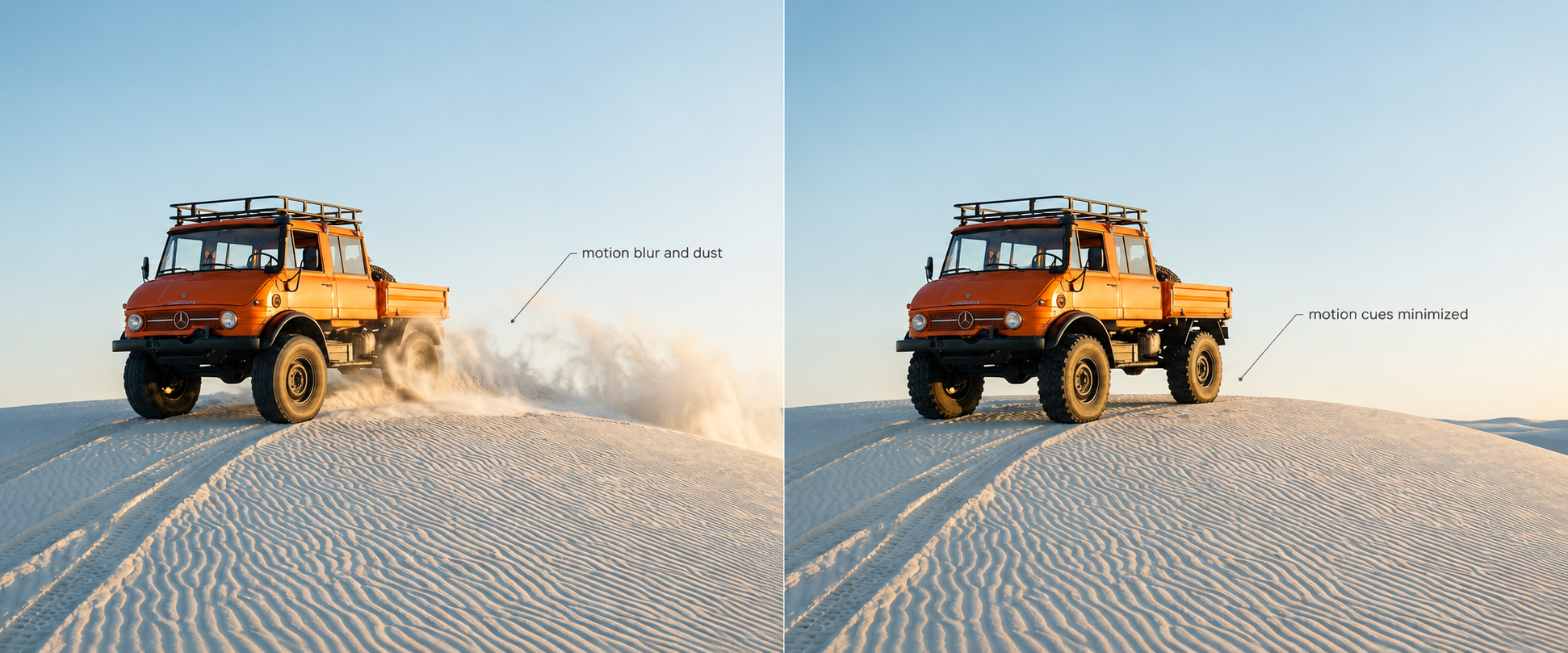
Removing dust and motion blur makes the source image more consistent with a stationary vehicle.
The Details Needed to Compare Mimisy’s Value
To compare Mimisy’s value with another generator, you still need its prices, input requirements, and download specifications. The available gallery record does not establish those details.
| Product detail | What to check |
|---|---|
| Required inputs | Whether the chosen template requires text, an image, another input, or a combination |
| Selection workflow | What opens after choosing a card and which settings are available |
| Duration and cost | How the listed lengths translate into available options and charges |
| Credits and retries | The price of a generation and how unsuccessful attempts are treated |
| Downloads | Resolution, file format, watermarking, and download availability |
| Usage terms | The rights attached to downloaded files |
| File handling | Storage, deletion, and access controls for submitted and generated material |
These are concrete comparison points, not reasons to dismiss a template library. A gallery may be easy to browse while its payment and output terms still need examination. The card durations already provide some information; the missing part is how those labels connect to the actual transaction and delivered file.
For a focused reference on storage and deletion questions, the privacy checklist for adult AI tools covers the relevant product details. For finding alternatives, the NSFWAITool directory offers a broader starting point.
Who Mimisy’s Gallery Suits Best
Mimisy’s visible library appears well suited to adults who prefer browsing visual concepts over starting with an empty prompt. Its categories offer several entry points, while the cards make differences in framing, arrangement, background, and stated duration easier to compare.
The breadth becomes cumbersome when several overlapping labels compete for attention. Readers with a narrow preference will get more from selecting one priority—such as framing or subject arrangement—and comparing a few cards consistently.
The supported verdict is straightforward: Mimisy is worth considering for its categorized browsing approach. Readers choosing primarily on price, available settings, or demonstrated output performance still need more product evidence before they can judge its value against another generator.